Connect API Payments
PCI Level 1 embedded payments widget shipped with $20M+ monthly volume in month one.
Plastiq · 2021–22 · Lead Product Designer
- Fintech
- API
- Developer Experience
- B2B
- $20M+ — Monthly volume in month 1
- 3 — Pre-launch partnerships
- 8 wks — Client onboarding time
Challenge
Build a PCI-compliant embedded payments widget that would let enterprise clients integrate card and ACH payments into their own platforms — while eliminating merchant fees, expanding working capital, and onboarding partners in weeks.
Approach
Set the product vision with the PM from nothing, then designed both sides of it — the payer-facing widget a partner embeds under their own brand, and the portal the partner’s developers use to integrate it. Built white-labelling into the token architecture as a partner override layer rather than a per-client skin, and designed the compliance constraints into the payment screens rather than around them. Billfire, Brex and PayGround committed before launch.
Outcome
$20M+ monthly payment volume exceeded in the first month, with three partnerships secured pre-launch and partners going from signed to live in about eight weeks. The component set the widget was assembled from became the most complete part of the system, and expansion work continued into 2022 across wallet, bank-linking and partner-software integrations.
Overview
Plastiq Connect let a company put card and bank payments inside its own product. A buyer could pay a vendor by card even where that vendor did not accept cards, and the vendor was paid the way it already got paid — domestic wire, ACH or a paper check in the mail. Plastiq sat in the middle and absorbed the difference.
Two products came out of that. A payer-facing widget the partner embedded and branded as their own, and a partner-facing portal for the developers integrating it. Different users, different problems, one system underneath.
My role
Lead product designer, 0→1. The core build ran roughly April to November 2021 with one product manager, one business analyst and five to seven engineers; expansion work continued through 2022.
- Set the product vision with the PM, from nothing
- Owned the payer flow end to end, and the partner portal alongside it
- Built the component set the widget was assembled from, including the partner-specific overrides
- Ran the expert interviews — prospective partners’ engineering and product teams, plus Plastiq’s own sales, operations and compliance staff — and the competitive benchmark against Stripe Connect
- Owned engineering handoff
What the research covered
Two groups, and the choice of groups is itself a decision. The engineering and product teams of prospective partners — the people who would actually have to integrate this — and Plastiq’s own sales, operations and compliance staff, who knew the payment rails, the underwriting rules and what the support queue already looked like.
Not payers. For an embedded product the partner is the customer, and it is the partner’s integration team that can end a deal in a technical review. Worth stating plainly rather than implying broader coverage: the research went deep with integrators and internal domain experts, and the payer was reached through them.
The competitive benchmark was Stripe Connect, and it settled what this product actually competed on. Not feature breadth — Stripe wins that. The wedge was that a partner could hand PCI scope and risk operations to Plastiq instead of building and certifying them in-house. Once that was the answer, the design brief changed: the job was to make “you do not have to build this” legible within the first few minutes of looking at the product.
That is why the portal opens on getting started rather than a dashboard, why sandbox is a top-level environment instead of a buried setting, and why documentation is linked from inside each feature rather than living on a separate site. A partner evaluating whether to outsource compliance is really asking how quickly they can prove it works.
What compliance actually constrained
PCI compliance is usually described as a checkbox. In practice it decides what a payment screen is allowed to show, and the decisions it forces are visible in the design.
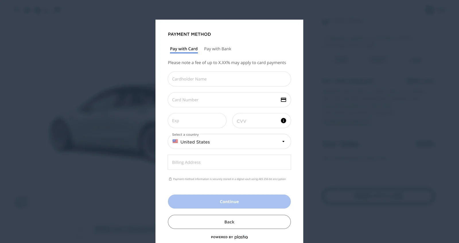
Stored card data is never redisplayed in full — a saved method shows as a masked number with its brand mark and nothing more. The security claim is made once, precisely, at the boundary of the card block rather than scattered through the form: a padlock and a single line stating that payment method information is held in a digital vault under AES 256-bit encryption.
The card fields are not fenced into a differently styled “secure zone” — the form reads as one continuous thing, with the assurance carried by the masking, the lock and that one sentence. Compliance shows up in this design as precision about what is stated and where, not as a visual quarantine.
Designing the payer flow
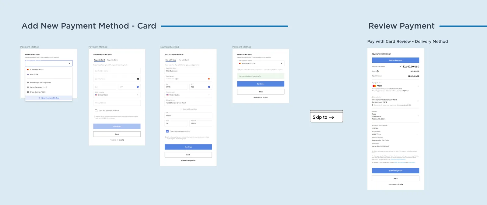
Six steps, and the order is the argument:
- Payer details — who is paying
- Recipient information — who is being paid, with category and country
- Delivery method — domestic wire, paper check or ACH transfer
- Payment method — card or bank, with saved methods selectable where they exist
- Payment details — amount, invoice or account number, account name, memo, attachments
- Review payment — amount, fees, total, masked method, delivery date, recipient, authorisation, submit
Delivery method is settled before payment method, which inverts the habit from consumer checkout. The vendor’s constraint is the fixed one: they accept a wire, or a check, or ACH, and no choice the payer makes changes that. Asking how the money has to arrive before asking how the payer wants to send it means the flow never offers a combination that cannot settle.
Two things on the payment details step do not exist in consumer checkout. Attachments, because a business payment travels with an invoice or a purchase order and whoever reconciles it later needs the document on the record. And explicit “(Optional)” marking — in a form this long, saying what is not required is how you keep it from reading as an interrogation. Continue stays disabled until the step validates, so the flow fails before submission rather than after.
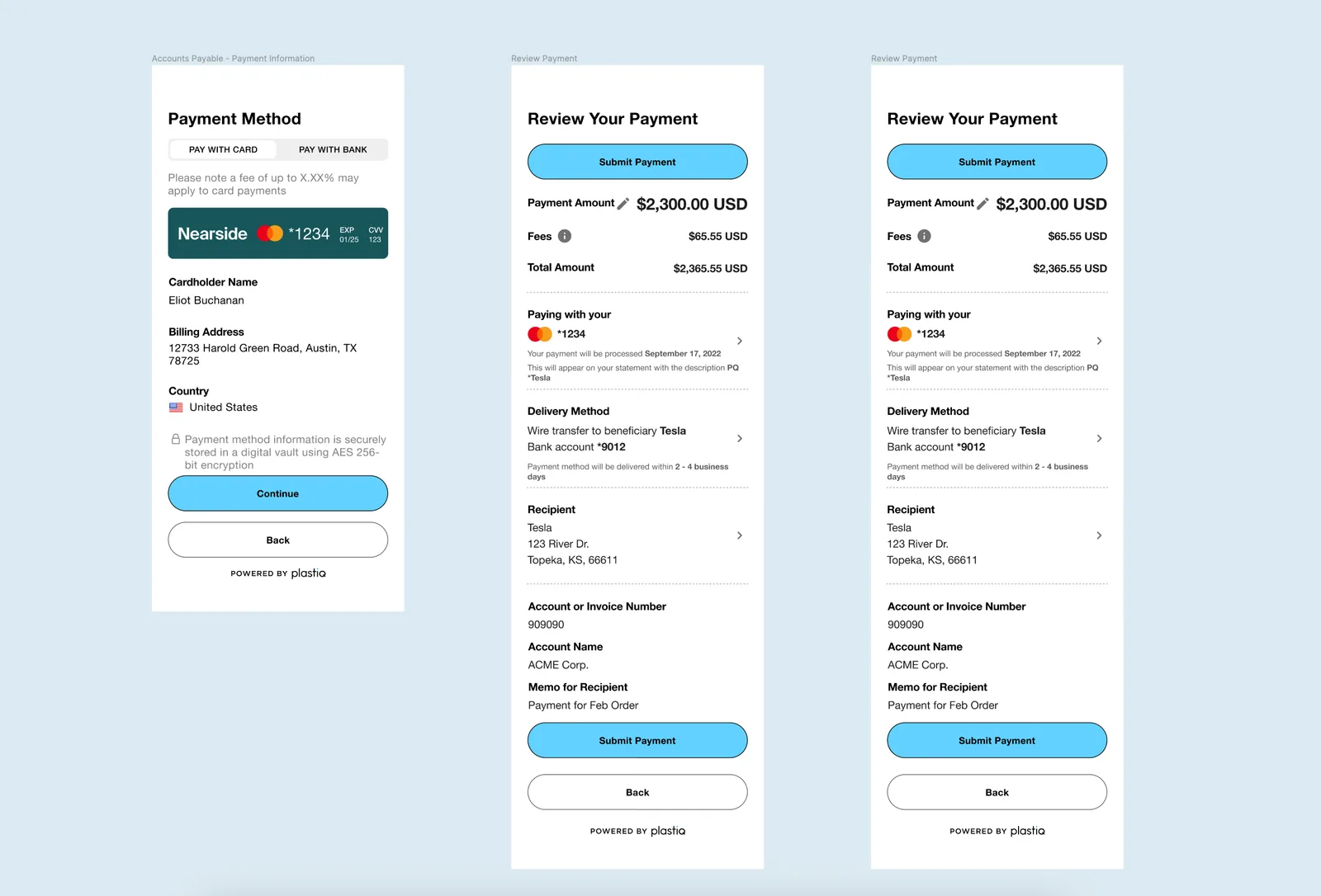
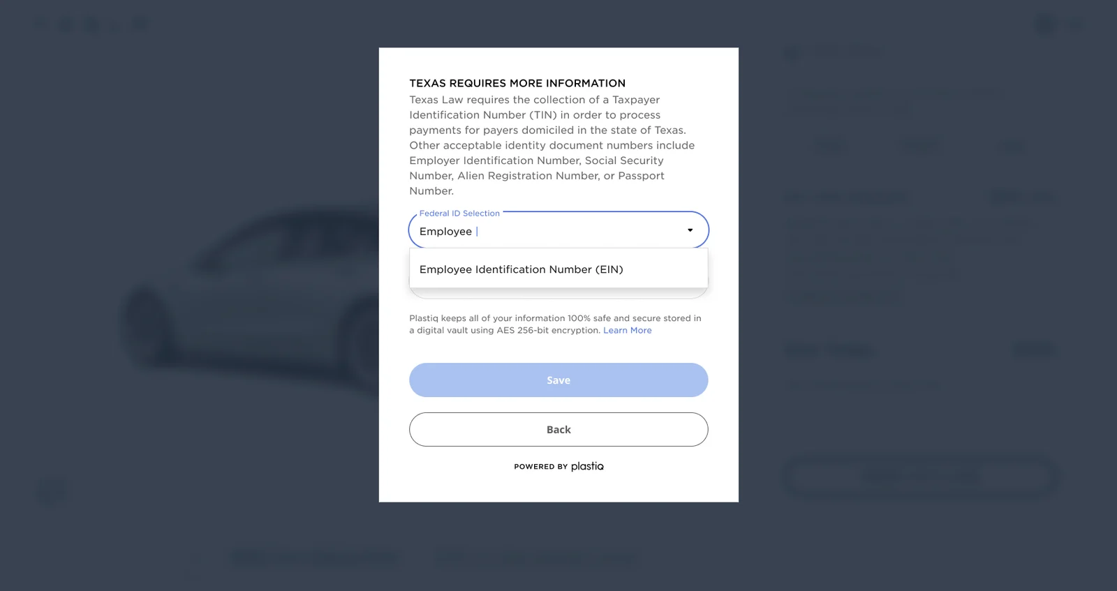
The review step is where regulation becomes copy. Anyone paying by bank is told they can revoke the authorisation by contacting Plastiq at least three working days before the delivery date. Anyone paying without an account accepts guest terms there, because paying as a guest was a first-class path and not a shortcut bolted on afterwards. Texas requirements are a component of their own, triggered only when the payer’s billing address is in Texas, because a state-specific disclosure has to appear in the flow rather than in a help page nobody opens — and it carries the reason, not just the field.
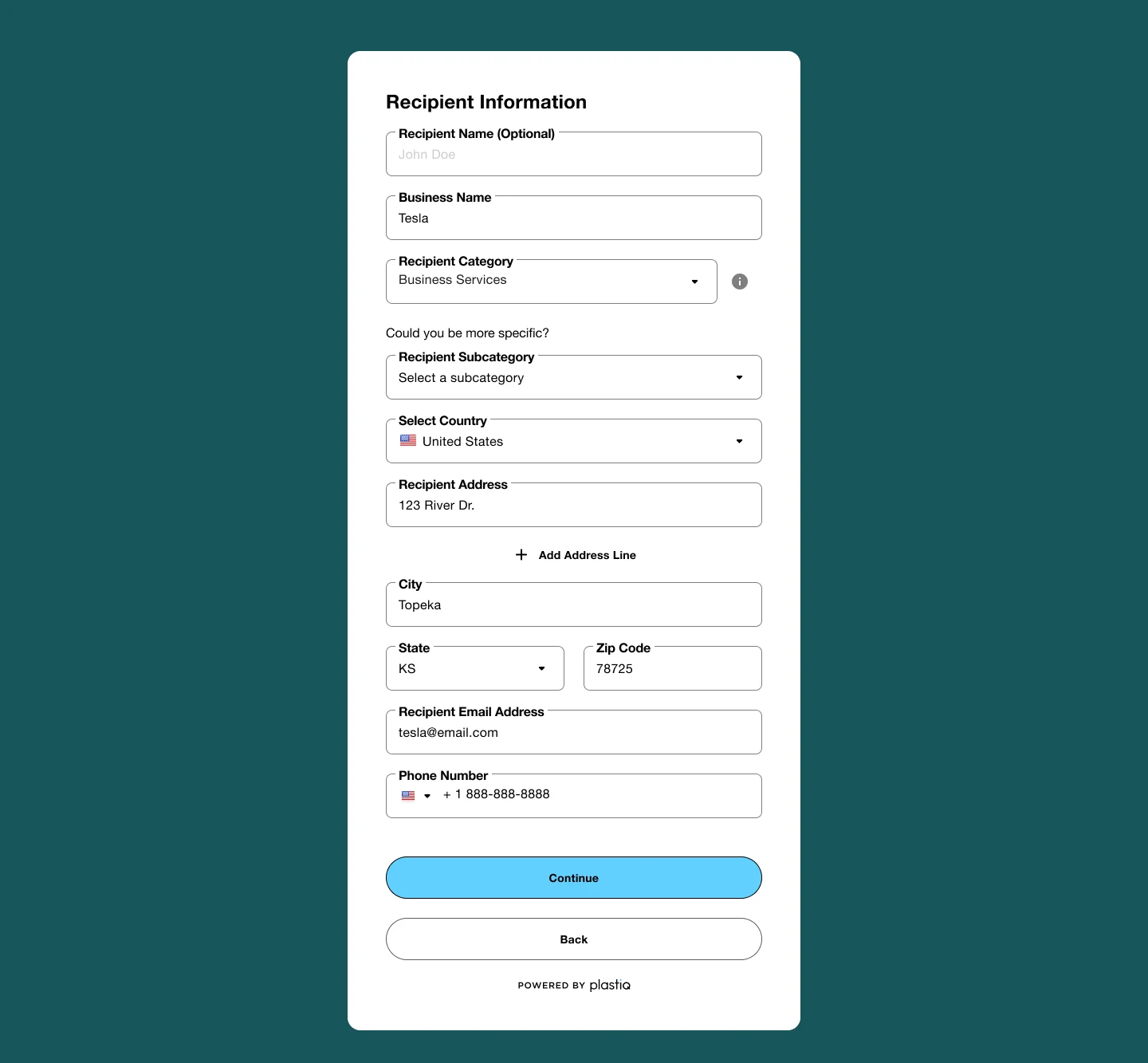
Compliance surfaces as fields, too. The payer step asks for beneficial owners with helper text on how to enter them — an anti-money-laundering requirement that cannot be hidden in an appendix, so it has to be made answerable in the flow. The recipient step classifies who is being paid: pick a category, and the form asks “could you be more specific?” before offering a subcategory. That pairing is how a recipient gets risk-classified without the payer ever being shown the word risk.
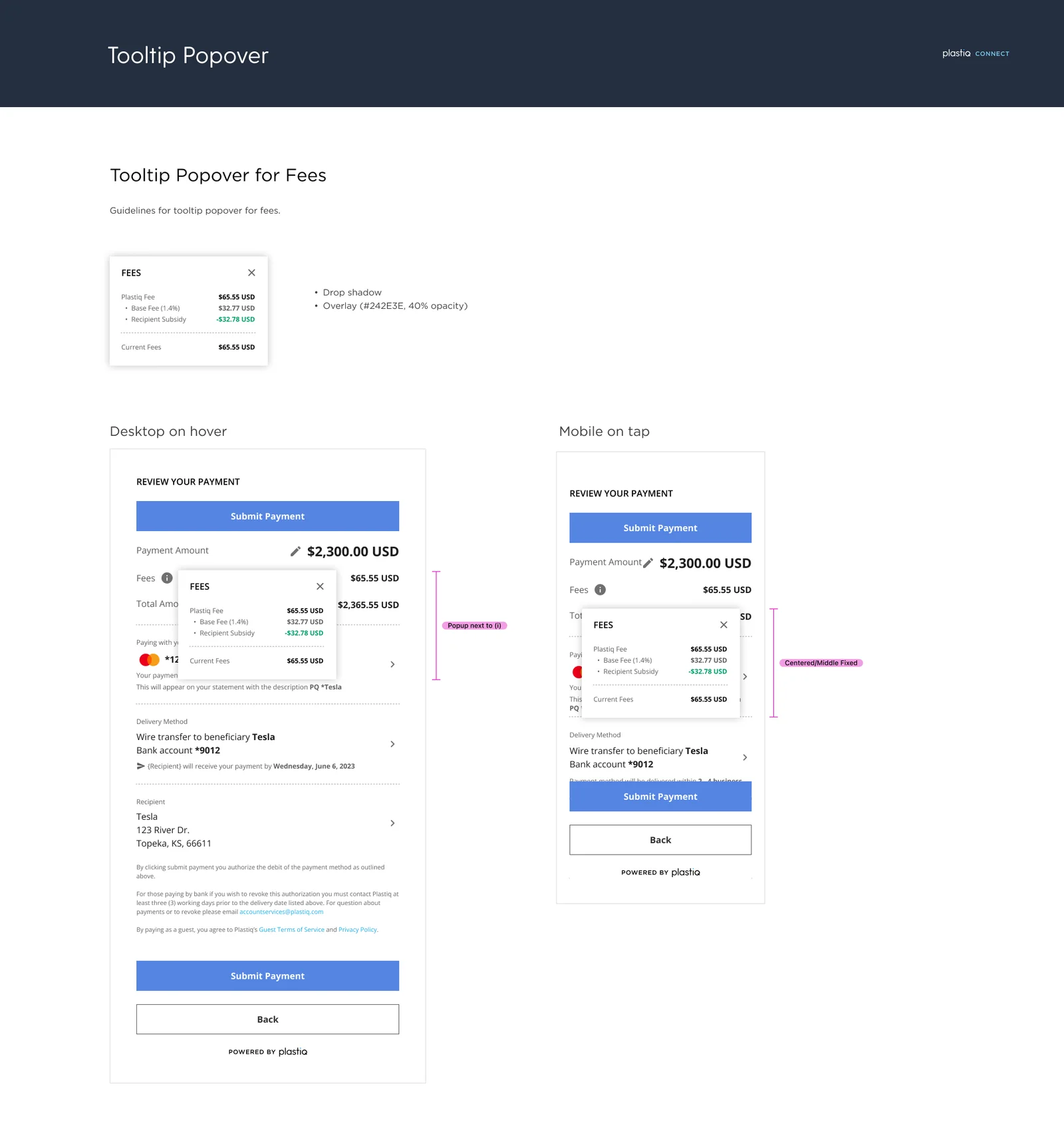
The fee is presented as a breakdown rather than a number. Opening it itemises the base fee and then a recipient subsidy line that offsets it, so a payer can see not just what they are paying but which part of it someone else absorbed. The same screen states the descriptor that will appear on the card statement. Both exist for the same reason: a payer who cannot reconcile a charge later opens a dispute, and a dispute costs more than the explanation would have. The amount itself stays editable at review, and submit repeats at the top and bottom, because the screen is long enough that finding the button again is a real cost.
Three passes at the same six steps
The flow went through three full versions. What changed between them is the useful part: the six steps and their order held from the first version to the last. What grew was coverage — more delivery-method combinations, filled and empty states for each, and eventually a parallel set of accounts-receivable screens alongside the payable ones.
That is the outcome you want from sequencing work done early. The decision about what order to ask things in was made once, against the constraint that the vendor’s accepted method is fixed, and then it survived two rebuilds. The versions after it were about completeness, not about reconsidering the spine.
Designing for someone else’s brand
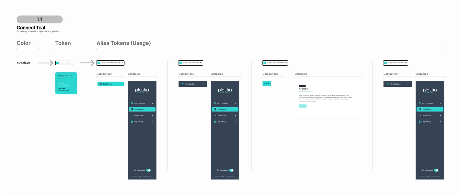
White-labelling was structural, not a skin. The token set has two layers: a base palette and type scale, and a partner layer that overrides it. That layer runs deeper than colour — partner-scoped colours carry their own opacity steps as named tokens, there are separate partner type roles for paragraph, field label and caption, and effects, gradients and strokes are tokenised alongside them. A partner’s blue becomes the primary while Connect’s own teal stays Plastiq’s brand, and nothing in the widget has to be redrawn.
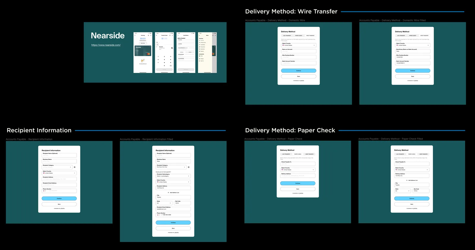
For Nearside it went further than tokens: a parallel component set — button, field, input, labels, upload — living beside the generic one, so partner-specific behaviour had somewhere to go that was not a fork of the widget.
One thing stayed fixed. Plastiq is disclosed in the footer of every screen even though the partner’s brand is everywhere else. A payer handing over a card is entitled to know who is processing it, and that mattered more than the cleanliness of the white label.
Specifying it for engineering
A widget that ships inside other companies’ products cannot be handed over as a picture. It gets rebuilt by engineers who will not be in the room, so the specification has to answer the questions they would otherwise have to ask.
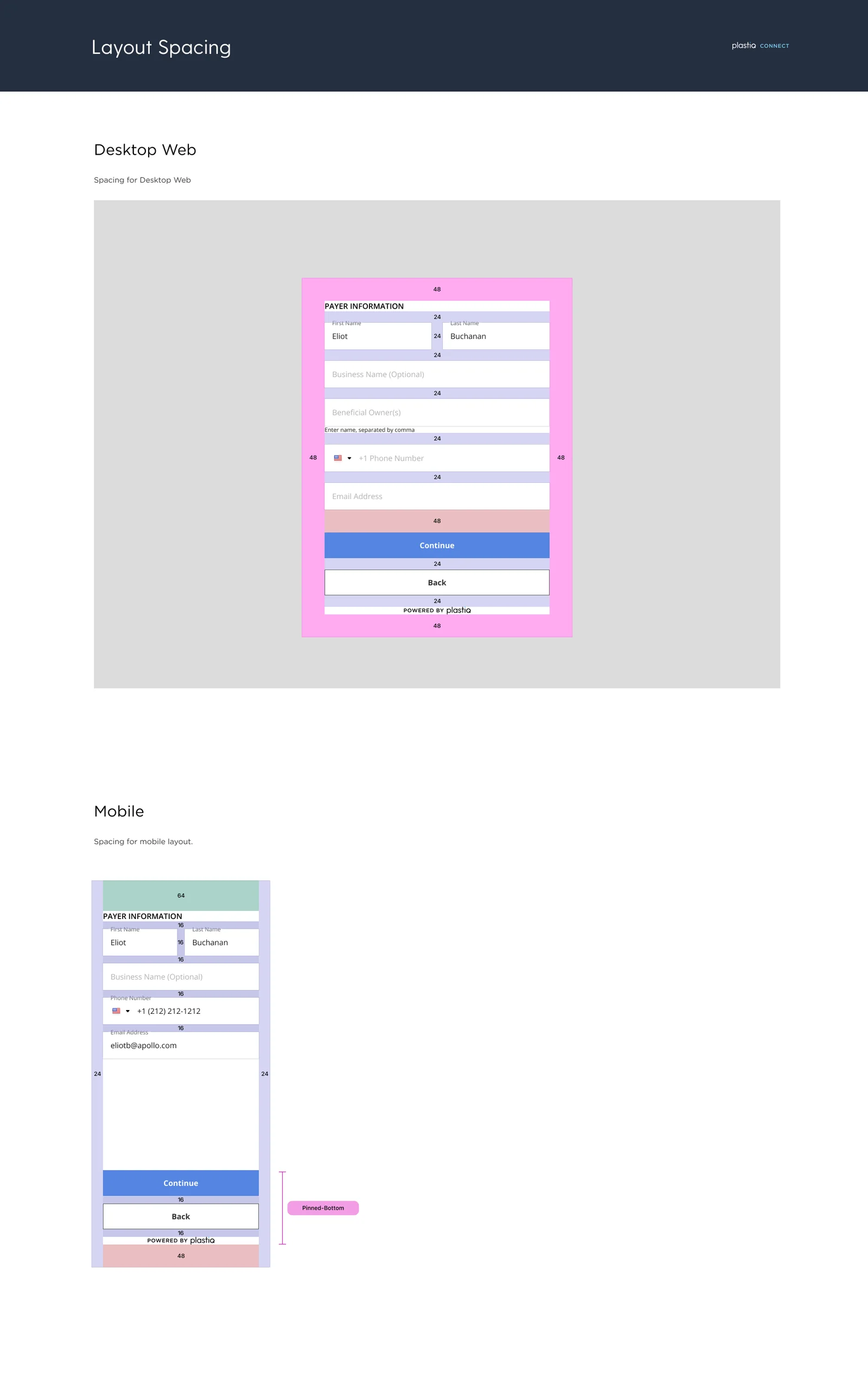
Spacing is called out per breakpoint with real values rather than left to inference, and the mobile layout names its own behaviour — the button block pins to the bottom rather than flowing with the content, so the primary action stays reachable on a form that scrolls.
Interactions were specified the same way, separately per input method rather than once and hoped for. The fee breakdown opens as a popover anchored beside its info icon on desktop hover, and as a centred fixed panel on mobile tap — two different behaviours, because a finger has no hover state and a popover anchored to a small target is a popover half off the screen. The overlay behind it is specified down to its colour and opacity.
The other product: the partner portal
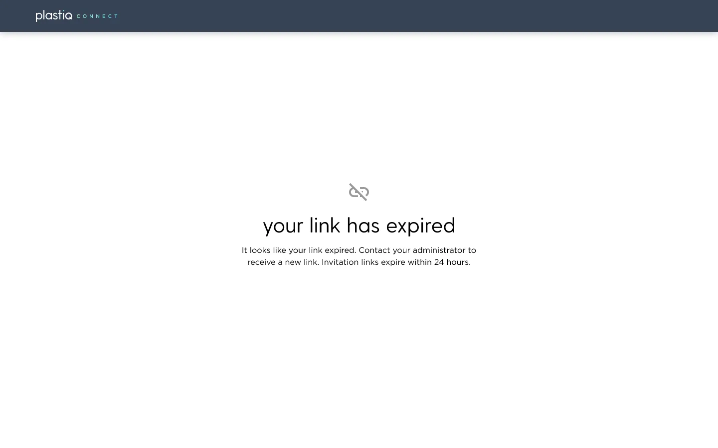
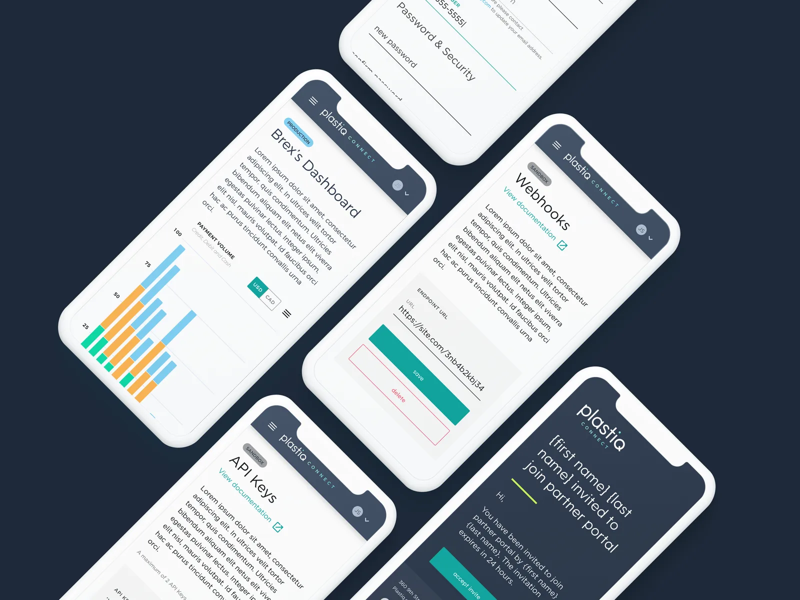
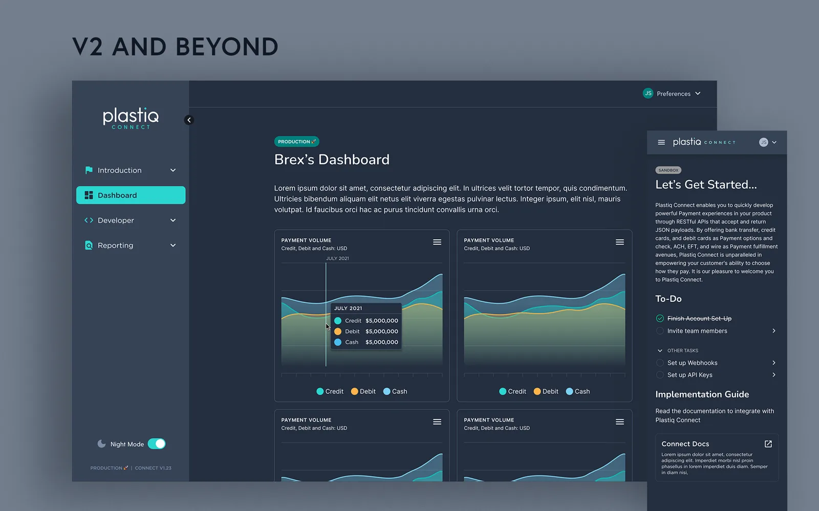
The portal’s user is a developer integrating the widget, and their questions are not a payer’s. Where are my keys. What is hitting my endpoint. Which transaction broke. The navigation answers those directly — get started, overview, transaction search, dashboard, API keys, IP whitelisting, webhooks, SDKs and widgets, reporting — with a sandbox and production split and the running version number pinned in the footer, so nobody has to guess which environment they are changing.
- API keys capped at two per account, shown masked to the last four characters, with the full lifecycle designed — none yet, created, rotated, deleted early, expired — and a confirmation that names the key by those last four rather than saying “key deleted”
- IP whitelisting capped at fifty, accepting single addresses and CIDR ranges, validating the offending row inline instead of rejecting the whole list
- Transaction search with a per-transaction issue state distinct from an empty result, because “no results” and “this payment has a problem” are different answers
- Team roles and permissions, with invitations that expire and say so
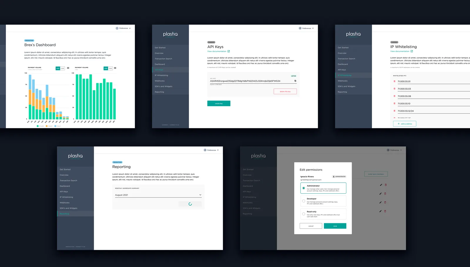
The operational states got the same attention as the happy path, because in a developer tool the failure is the product. An expired invitation is a dead end that produces a support ticket unless the page tells you exactly what happened and what to do, including how long the window was.
How the portal got to that shape
The portal did not start there. The developer tools — API keys, IP whitelisting, webhooks — were worked through in a separate exploration file at three fidelities: lo-fi, then hi-fi, then a dedicated deep dive on manual key rotation, the one flow with enough branching to deserve its own study. There is also a page explicitly labelled “concepts, do not use”, which is the cheapest documentation a design file can carry: it stops someone reopening a dead idea six months later.
The state names that came out of the hi-fi pass — zero state, key created, key rotated, filled with validation error, scroll list, delete item, read-only saved — carried into the live portal essentially unchanged. The design converged early and stayed converged.
The analytics and operations half of the portal — dashboard, transaction search, reporting — was designed later and directly in the live file rather than explored separately first. Transaction search ended up the most component-heavy page in the product: detail layout, disbursement information, payment originator, status icons, a timeline, and an issue block, because tracing a payment that went wrong is a different task from finding one that went right.
Extending the surface
Once the core shipped, the work moved to everywhere else Connect could sit. These reached design and discovery rather than production, and are worth naming for what they were:
- Wallet — stored payment methods layered over both the card and bank paths, so a returning payer picks a saved method from a dropdown instead of re-entering it
- Plaid — the full bank-linking sequence: pick a bank, or fall back to entering routing and account numbers by hand; personal or business; checking or savings; authorise; verify by phone, email or text. The manual path exists because bank pickers do not cover every institution, and a payer blocked at bank selection is a payer who leaves
- Freshbooks — Connect embedded as a panel inside a partner’s own accounts-payable product, a different surface from a checkout, with a numbered flow for creating recipients by wire, check or ACH
- Internationalisation — honestly a typography feasibility audit: one string set in five typefaces across the twelve most spoken languages, which found at least one script a candidate face could not render. Worth knowing before a partner in that market asks, not after
The Freshbooks work is where the design file stops being pictures and starts being specification. Written into it, next to the screens: the check payable field should be prefilled with the recipient name; wire payments need a country selection; ACH does not, because ACH is US-only. Three lines, each one a decision an engineer would otherwise have to ask about or guess at.
The Plaid file carries the same habit in a less comfortable form — a known limitation in the authorisation flow, that a user has to come back to verify, recorded in the design rather than left to surface in QA. Documenting the thing that does not work yet is how the next person avoids designing on top of it.
The receivable side: getting a business paid
Paying is only half of a payments product. A business on the receiving end has to be onboarded and underwritten before money can be sent to it, and that is its own design problem — a long, invasive form that people abandon.
The know-your-business flow asks for the deposit account, the business address, the industry, the EIN, monthly expenses, employee count, years in operation, whether the business carries a corporate card, what goods or services it sells, what kinds of customers it sells to, proof of web presence, and a sample invoice or contract — up to twelve files, with the accepted formats and the size limit stated rather than discovered on rejection. It ends by telling the applicant the review takes under 24 hours.
The pattern throughout is the same one as the invoice upload on the payable side: when you have to ask for something intrusive, say what it is for and what happens next. A form this long cannot be made short, so the work goes into making it finishable — constraints declared up front, a stated turnaround at the end, and no step that fails silently.
Registration had three routes, which matters for an embedded product: through Plastiq’s own site, through a partner-hosted link — built out for Billfire, so any biller they pointed at it could register and onboard without touching Plastiq’s own front door — or inline in the widget with no Plastiq account at all. The third is the one that makes it genuinely embedded rather than a redirect wearing a partner’s colours.
The partners
Billfire, Brex and PayGround all committed before launch, which for a 0→1 payments product is the harder proof — they were integrating against something that did not have a track record yet.
PayGround is the one that shows what the flexibility was for. It is a patient-facing app for medical bills, built by a founder who had faced twenty-one separate bills from different providers, each with its own portal, its own accepted method, and paper statements arriving after he had already paid. Connect let a patient pay any provider by ACH, credit, debit or an HSA or FSA account — while each provider kept receiving payment the way it always had, by check or ACH deposit. Two different sets of rules on either side of one transaction, which is exactly the problem the delivery-method-first sequencing was built for.
Plastiq’s APIs enabled us to seamlessly integrate our mobile app and payments capabilities. From day one, we received a ton of support from team Plastiq, helping with engagement and fueling the project.
Adam Younger, COO of PayGround
Outcomes
The widget and portal cleared $20M+ in monthly payment volume within the first month of launch, with three partnerships secured before it. Partners could go from signed to live in about eight weeks — and that was a design target, not a sales number. The portal, the sandbox environment, the key lifecycle, the inline documentation links and the version label pinned in the footer all exist to compress the span between a signed contract and a first successful API call. Of the three headline numbers, it is the one design can properly claim, and Plastiq went on to publish it as its own integration commitment.
The component set the widget was assembled from became the most complete part of the system, and it was built inside the product rather than in a separate library file, which is why it survived. A parallel effort to stand up a formal Connect design system stayed in discovery; the one that shipped was the one attached to something being shipped.
Reflection
The unusual part of this project was designing two products for two audiences who never meet and cannot be shown the same thing. The payer sees a form and should never think about Plastiq beyond one line in the footer. The developer sees Plastiq’s machinery and needs every seam labelled. Getting the payer flow right meant hiding structure; getting the portal right meant exposing it. The token architecture is what let both be true at once — one system, two very different faces, and no fork to maintain.