Most operations teams do not start with a platform. They start with whatever helps them move fast. That usually means spreadsheets, manual handoffs, Slack messages, and a growing stack of workaround logic.
That is normal. The problem comes later, when those tools become the operating system for a complex team. At that point, the issue is no longer tooling preference. It is product debt.
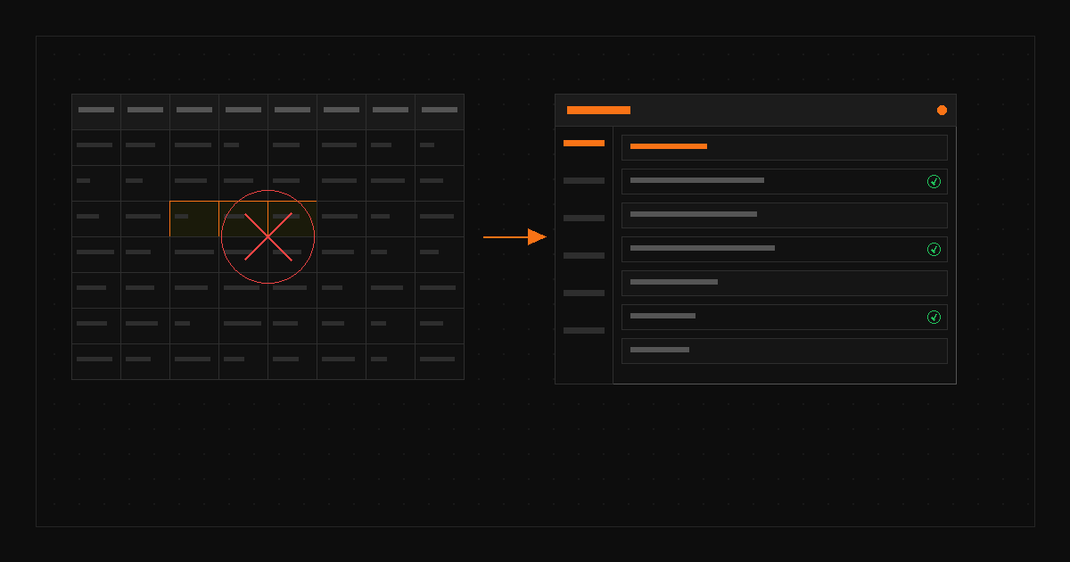
A lot of teams think the solution is to “put everything into one dashboard.” That is not enough. Good ops platform design has to model how work actually moves. Who owns what? What decisions need attention? What exceptions matter most? What needs to be tracked historically? What should be automated?
Replacing spreadsheets with product means designing for visibility, accountability, and action, not just prettier tables.
At Wisdom, operations teams were managing work across 200+ spreadsheets. I designed Management Portal to consolidate critical workflows into a centralized hub for reporting, dashboards, and AI-assisted insight. The platform helped shift reporting from hours to minutes and created a stronger operational foundation for scaling from 260 offices toward 900.
When you replace spreadsheet sprawl with the right product UX, the business gets more than cleaner screens. It gets faster decisions, clearer ownership, lower operational drag, and less churn risk caused by weak visibility. That is why ops UX deserves the same design rigor as customer-facing product.