Unified Ad Platform
Seven Disney ad-sales brands brought onto one platform without breaking the workflow it already ran.
Disney (DTCI) · 2019–21 · Senior UX Designer
- Enterprise
- Design System
- Multi-brand
- React
- 8 — Brand perspectives aligned
- $M+ — Booking impact
- 2 — Designers led
Challenge
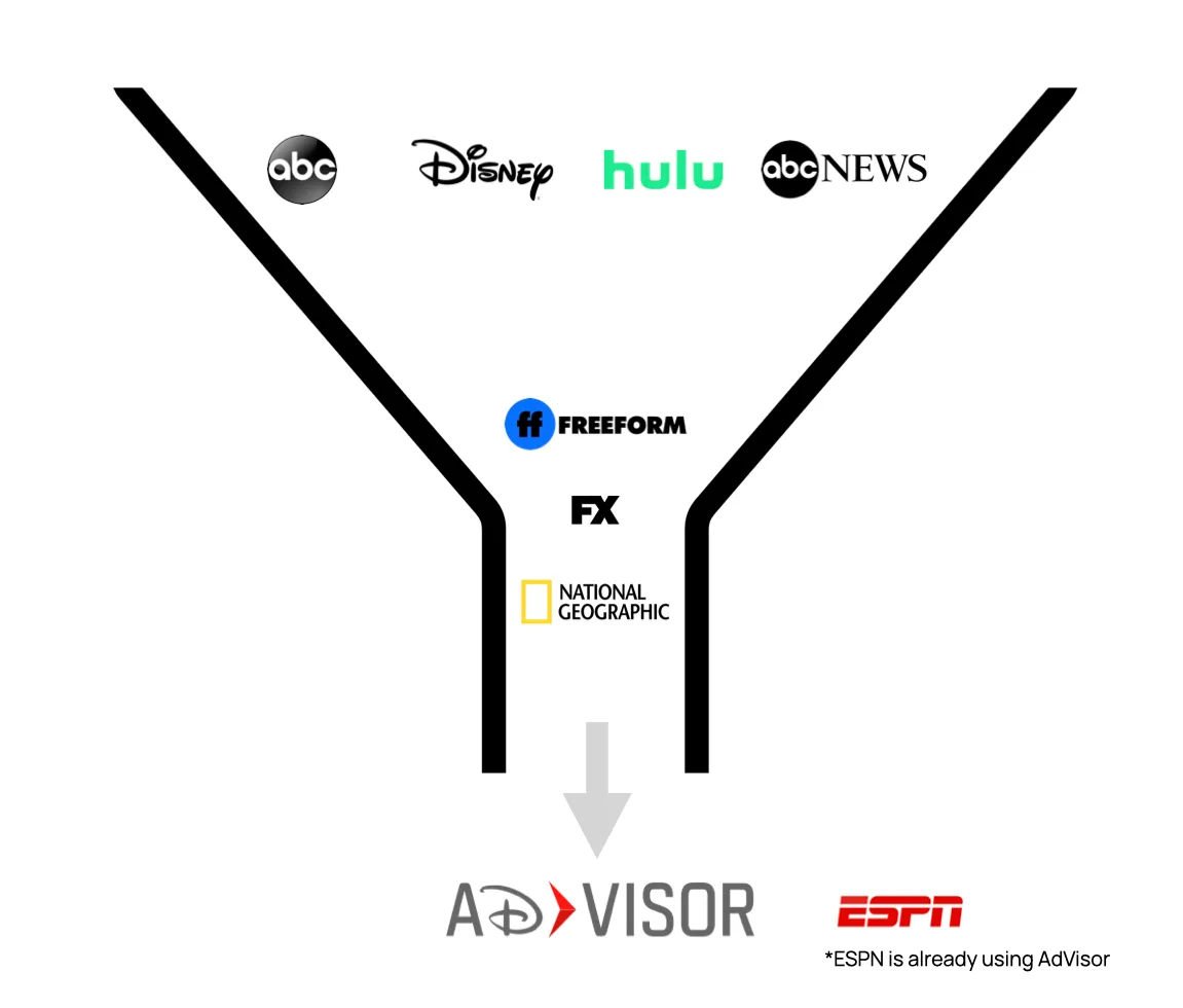
ESPN was already operating on AdVisor. Every other Disney ad-sales brand ran its own platform, with its own tooling, language and operational expectations — so booking across the portfolio meant working in unrelated systems. The job was bringing those brands onto AdVisor without regressing the workflow ESPN depended on every day.
Approach
Started by mapping the decision flow rather than the screens, building a current-state workflow map that exposed handoffs, timing windows and operational risk across teams. Aligned eight brand perspectives on a shared model without flattening the differences that mattered, then designed dense data views as decision surfaces and built reusable interaction patterns engineering could turn into React components for future Adapt design-system alignment.
Outcome
Disney ad-sales brands unified under AdVisor with the ESPN baseline preserved and brand-specific needs still supported. Standardised product language, reusable interaction patterns, and groundwork for Adapt alignment. Directors and stakeholders aligned, and follow-up interviews turned into user stories that made later discovery easier.
Overview
AdVisor is the ad-sales platform at Disney's Direct-to-Consumer and International group. When this project started it served ESPN and no one else. ABC, Disney, Hulu, ABC News, Freeform, FX Networks and National Geographic each ran its own tooling — jda, WideOrbit, PACE, NCS and OnAir among them — so booking across the portfolio meant working in unrelated systems. The work was consolidating those seven brands onto one platform, and the constraint that shaped everything was that ESPN's existing workflow could not regress while it happened.
The work was about decision confidence, not decoration. Expert users needed speed, control, validation and workflow clarity inside a high-value operational system where a mistake has real money attached.
My role
September 2019 to March 2021. Started as a UX designer on the effort and moved into the lead designer role toward the end, leading two other designers on this project.
- Partnered with 7–10 engineers, one PM, one business analyst, brand directors and sales/ops stakeholders
- Mentored the two designers on this project and others on the wider design team
- Owned discovery, workflow mapping and stakeholder alignment
- Owned UX strategy, interaction design, visual design and design-system alignment
- Owned engineering handoff
Why it was complex
Consolidation was a workflow problem before it was a UI problem. Complex products fail when the team simplifies away the constraints their users actually work under, so the standard here was to simplify without dumbing down. The difficulty came from several directions at once:
- Multiple brands with different teams, goals and operating expectations
- Dense data — users needed large grids, search, filters, status and comparison
- Business rules where front-end decisions had to respect backend-driven logic
- Legacy language, where different terms often described the same business concept
- High-value edge cases that could not be deferred until after launch
- The ESPN baseline, which had to be preserved throughout
Aligning eight brand perspectives
Each brand had valid operational needs. The design challenge was creating a shared model without flattening the differences that actually mattered to how those teams worked.
- Eight brand perspectives
- Opinionated directors and business stakeholders
- ESPN's existing AdVisor workflow
- New brand-specific requirements
- Product, design, engineering and sales/ops priorities
What the audit covered
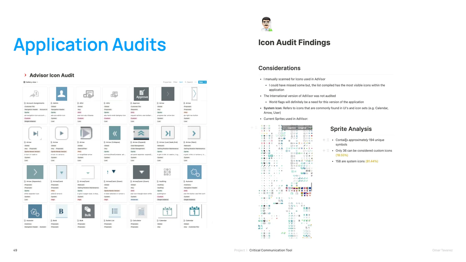
Before anything was designed, the existing platforms were audited across every brand — reporting, client relations, dashboards and data visualisation, and the internal communications teams relied on to move work between them. It is what turned the legacy-language problem from an impression into an inventory: the same business concept named several different ways, each name load-bearing for the team that used it.
Mapping the decision flow, not the screens
Discovery started with the decision flow rather than the interface. The goal was finding where users needed speed, where they needed control, where they needed validation, and where they needed confidence before committing to an action.
- Stakeholder interviews across brands and functions
- Workflow mapping and current-state journeys
- Pain-point clustering across the mapped workflow
- Constraints, assumptions and edge cases documented as first-class inputs
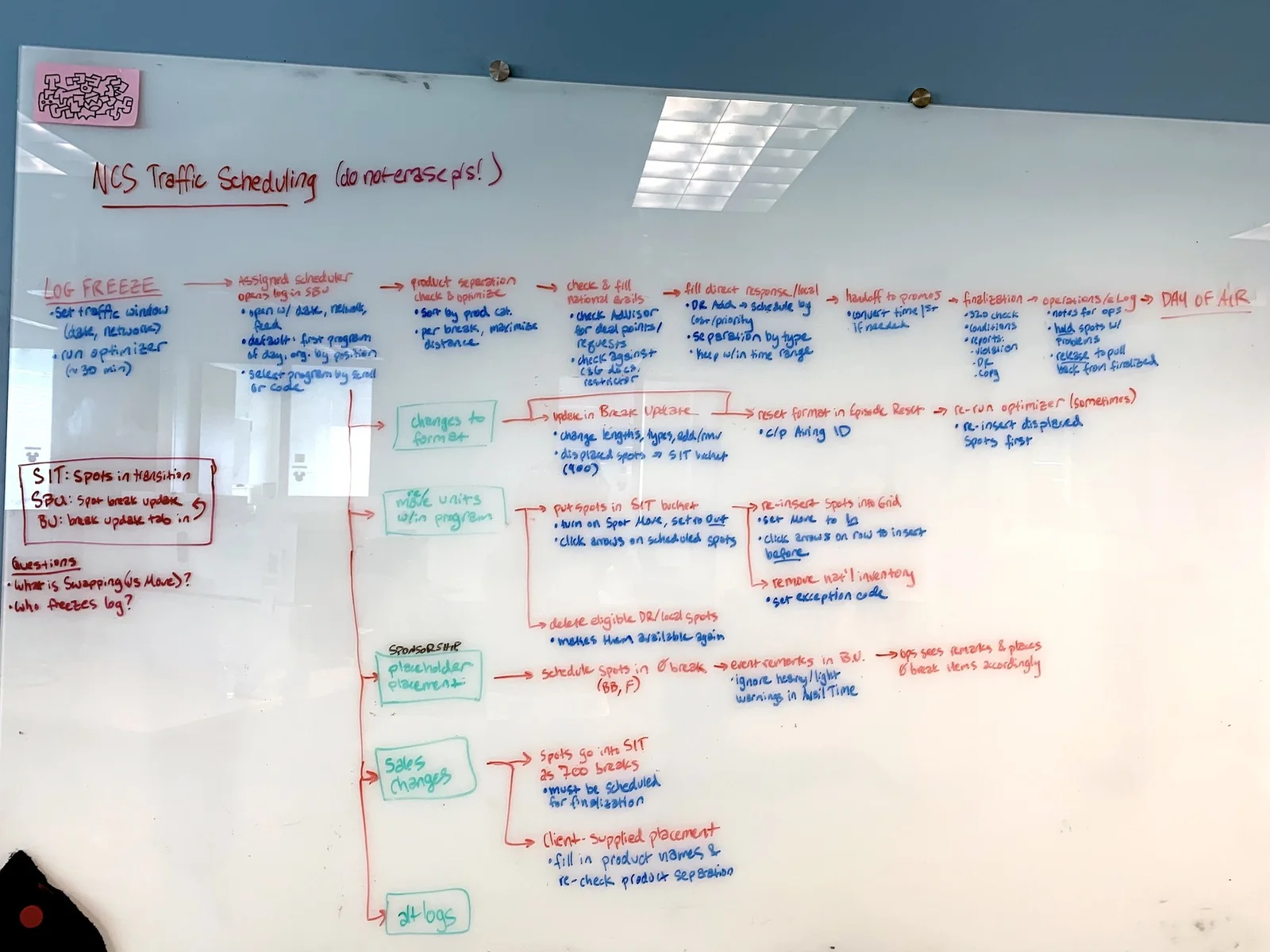
The most important early design artifact was not a mockup. It was the workflow map — a current-state view that made handoffs, timing windows and operational risk visible to people who had only ever seen their own part of it.
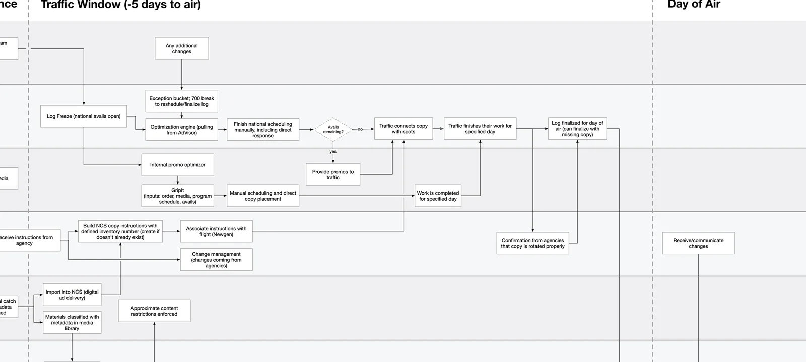
The map traced how a single decision actually moved: through sales, traffic, promo, legal, operations, research and accounting. Seeing the whole chain at once is what made the product conversations concrete — people who had only ever worked one step of it could finally point at where it broke.
What the research changed
The product model had to be shared, but not generic. Six things came out of discovery that shaped everything after it:
- Brands were not simply asking for different UI — they had different operating models
- ESPN was a useful starting point, not the universal answer
- Dense views were necessary, but timing mattered more than density
- Terminology was as important as screen structure
- Edge cases were core to the workflow, not exceptions to handle later
- Alignment needed artifacts — maps and prototypes let stakeholders decide together
Design principles
The strategy was to preserve expert control while making the decision path clearer and more consistent.
- Make the decision path visible
- Expose constraints without overwhelming users
- Preserve expert control
- Standardise language and interaction patterns
- Design edge cases into the core workflow
- Create reusable patterns for engineering scale
Making high-volume decisions scannable
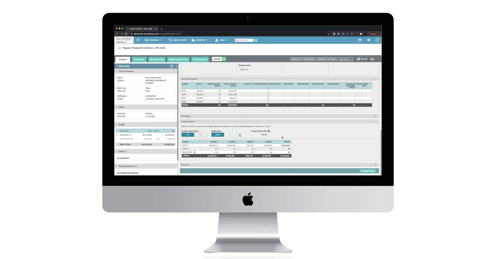
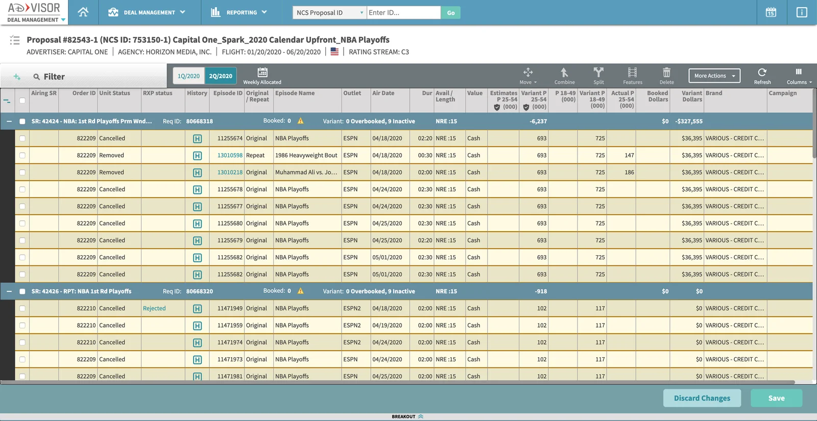
Dense grids had to work as decision surfaces. Users needed to scan a few hundred deals, filter to the relevant slice, compare across rows and identify the next action without losing their place.
Complex tasks were structured around how expert users already thought about the work: summary first, then validation, then exceptions, then action. Expert users do not need less information — they need the right information at the right decision moment, so progressive disclosure was used to control timing rather than volume.
A foundation beyond one workflow
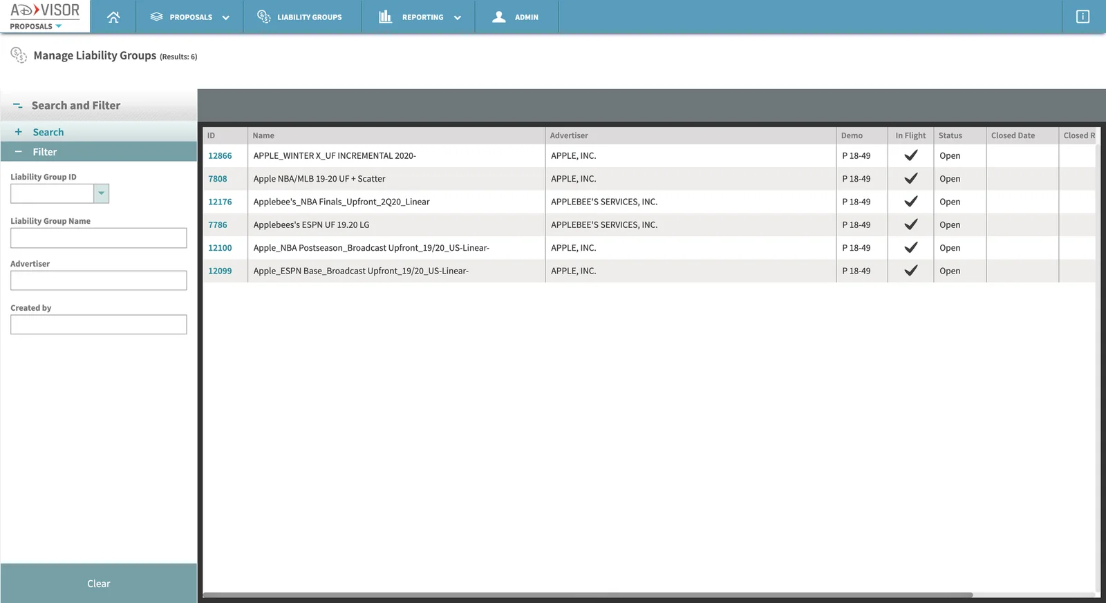
The interaction patterns were designed to be reused. Navigation, search, forms, validation, status and save/submit actions were standardised so engineering could translate them into scalable React components, and so the work could later align to Adapt, Disney's cross-brand design system.
That went further than a pattern list. By the end, UX and engineering had started an ad-sales design system in its own right — documentation alongside the React components — built so the team could switch it on when they were ready instead of retrofitting one later.
Outcomes
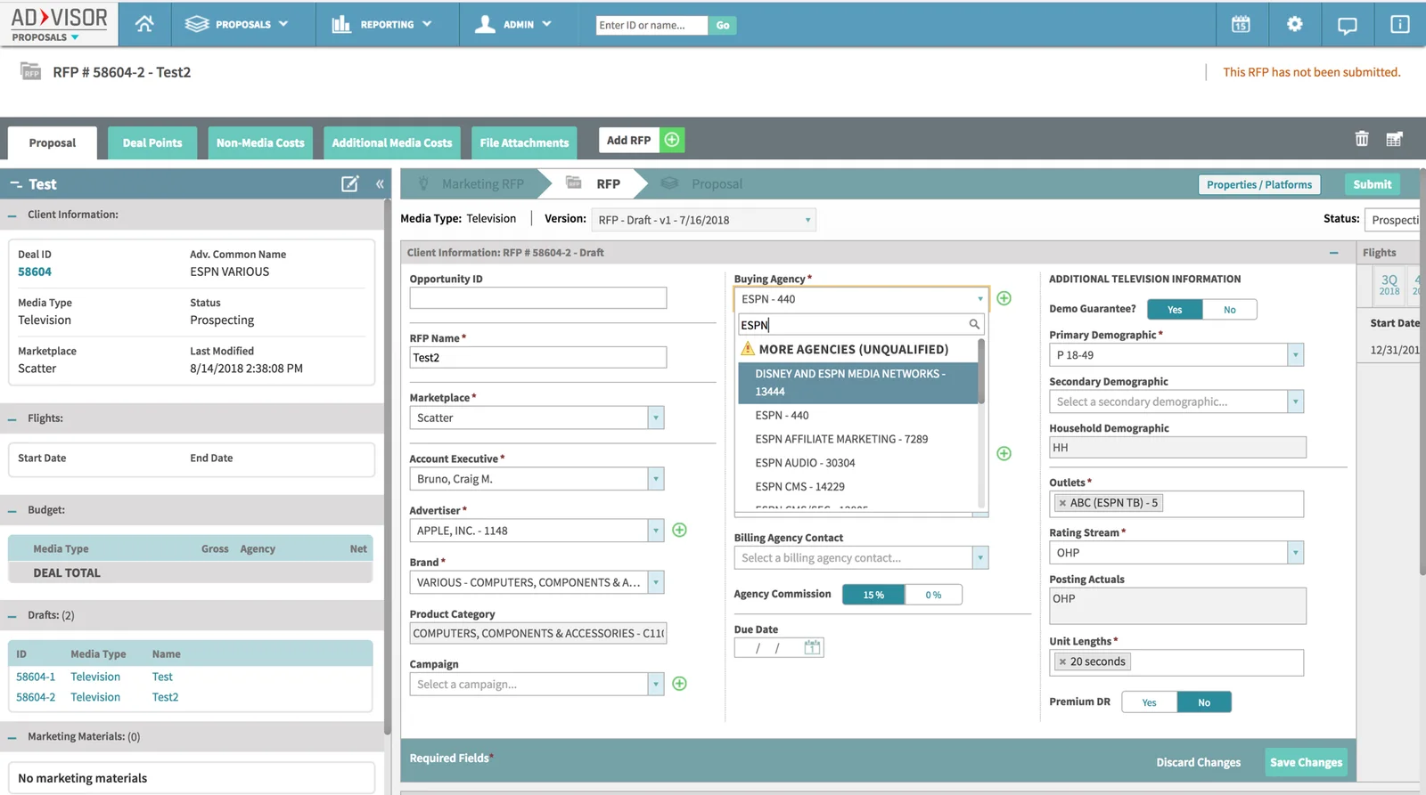
Product: the first wave brought FX Networks, National Geographic and Freeform onto AdVisor, with ESPN functionality preserved and brand-specific needs still supported inside a shared workflow. Platform migration finished ahead of user onboarding: the brands were live in AdVisor while their teams were still being moved across in stages. Ahead of the full release some Freeform users had yet to be onboarded, and everyone already migrated was doing their day-to-day work in the new system rather than the one it replaced.
System: standardised product language, reusable interaction patterns, and an ad-sales design system started with documentation and React components intended for Adapt alignment.
Process: directors and stakeholders aligned, follow-up interviews turned into user stories, and future discovery and delivery made easier.
Reflection
Knowing the limits of what could be researched with the resources available — and knowing when to hand a concept off — mattered more than any single design decision. Resources were scarce early and plentiful later, which changed what was possible at each stage. The platform still had a long way to go, but the shared model and the pattern library gave the next team something to build on rather than around.